
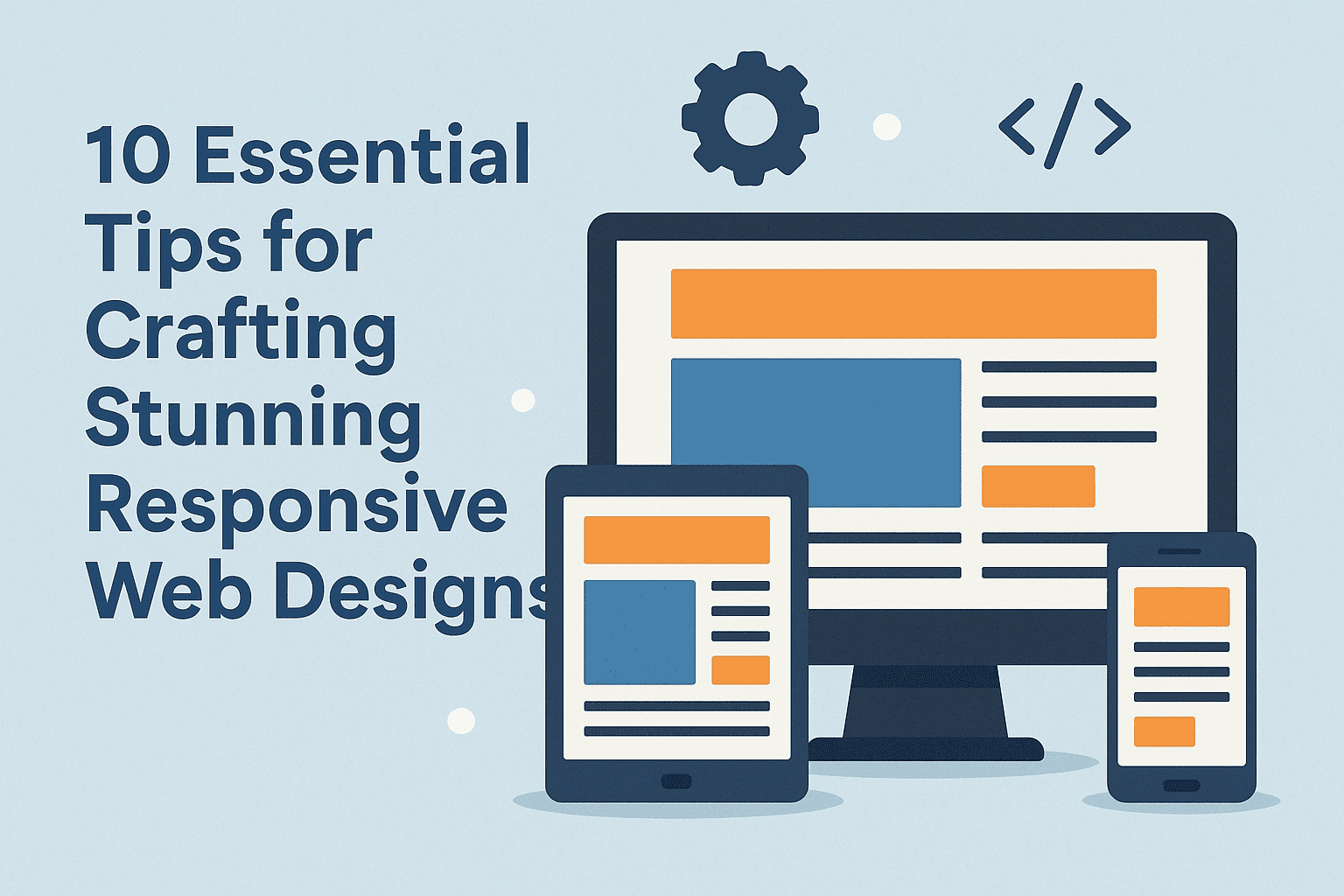
Responsive web design ensures your website delivers an optimal experience across every device - from large desktop monitors to tablets and mobile phones. With over 60% of web traffic now coming from mobile devices, responsive design is not optional - it directly impacts user experience, conversion rates, and search engine rankings. Here are 10 essential tips for creating responsive web designs that look stunning and perform well on every screen size.
1. Start with Mobile-First Design
Design for the smallest screen first, then progressively enhance for larger viewports. Mobile-first forces you to prioritise content and functionality - what is essential versus what is nice to have. Use min-width media queries to add complexity as screen size increases rather than max-width queries to remove elements on smaller screens.
2. Use Fluid Grid Layouts
Replace fixed pixel widths with relative units - percentages, viewport units (vw/vh), and CSS Grid or Flexbox. Fluid grids allow your layout to scale proportionally between breakpoints rather than jumping between fixed layouts. CSS Grid and Flexbox provide powerful responsive layout capabilities without the complexity of older float-based systems.
3. Make Images Responsive
Images should scale with their container and load at appropriate sizes. Use CSS max-width: 100% to prevent images from overflowing their containers. Use the HTML srcset attribute to serve different image sizes based on viewport width, reducing bandwidth for mobile users. Use WebP format for smaller file sizes with equivalent quality.
4. Use Responsive Typography
Typography should be readable on every device without zooming. Use relative units (rem, em) for font sizes instead of fixed pixels. Consider CSS clamp() for fluid font sizing that scales smoothly between minimum and maximum sizes: font-size: clamp(1rem, 2.5vw, 1.5rem). Ensure line length stays between 45-75 characters for readability.
5. Design Touch-Friendly Interfaces
Mobile users interact with fingers, not cursors. Make buttons and interactive elements at least 44x44px (Apple's recommendation) or 48x48dp (Google's recommendation). Add adequate spacing between tap targets to prevent accidental taps. Replace hover-dependent interactions with tap-friendly alternatives.
6. Optimise Navigation for All Screens
Desktop navigation patterns rarely work on mobile. Implement a mobile-friendly navigation pattern - hamburger menu, bottom navigation bar, or expandable sections. Keep navigation hierarchy shallow on mobile. Test navigation usability with real users on actual devices.
7. Test on Real Devices
Browser DevTools device emulation is useful but does not catch everything. Test your responsive design on actual phones and tablets to verify touch interactions work correctly, font sizes are readable without zooming, forms are usable on mobile keyboards, images load correctly at different resolutions, and performance is acceptable on lower-powered mobile devices.
8. Prioritise Performance
Mobile devices often connect over slower networks with limited bandwidth. Optimise responsive performance by lazy loading below-fold images and videos, minimising CSS and JavaScript file sizes, using system fonts or subset custom fonts, reducing HTTP requests, and implementing a content delivery network (CDN). Every 100ms of improved load time increases conversion rates.
9. Use Strategic Breakpoints
Set breakpoints based on your content, not on specific device dimensions. Let the design tell you where it breaks - resize the browser and add breakpoints where the layout stops working. Common breakpoint ranges are 480px, 768px, 1024px, and 1200px, but your content should determine the exact values.
10. Ensure Accessibility
Responsive design and accessibility go hand in hand. Ensure sufficient colour contrast ratios, provide text alternatives for images, support keyboard navigation, use semantic HTML elements, and test with screen readers. Accessible design benefits all users and is increasingly a legal requirement.
Need Help with Responsive Web Design?
DigiXoft provides responsive web design services that deliver stunning results across all devices. Our web design team follows mobile-first best practices to create fast, accessible, and conversion-optimised websites. Contact us to discuss your project.
Frequently Asked Questions
What is responsive web design?
Responsive web design is an approach where a website automatically adapts its layout, images, and content to fit the screen size of the device being used - whether a desktop monitor, tablet, or mobile phone. It uses fluid grids, flexible images, and CSS media queries to create a single website that works everywhere.
Why is responsive design important?
Over 60% of web traffic comes from mobile devices. Google uses mobile-first indexing, meaning it evaluates the mobile version of your site for ranking. A non-responsive website delivers poor mobile UX, loses mobile visitors, and ranks lower in search results. Responsive design is the standard expectation for modern websites.